Why is Go's mascot a gopher?
Most programming language mascots are committee output. Someone decides the project needs a friendly face, an agency is briefed, and something inoffensive arrives with a style guide attached.
The Go gopher isn’t that. It’s the work of a single illustrator, it predates the language by the better part of a decade, and its first job had nothing to do with software.
The radio station
The gopher was drawn by Renée French, a cartoonist and illustrator whose own work runs a good deal darker than cheerful rodents — her graphic novels are unsettling in a very deliberate way.
An early version of the character appeared on promotional material for WFMU, a freeform radio station in New Jersey, around the turn of the millennium. It was a one-off illustration job. The gopher had no connection to programming, no licence attached, and no particular future.
When Go was released publicly in 2009, the gopher came with it. French is married to Rob Pike, one of Go’s creators, which is the unglamorous answer to how a radio station’s mascot ended up representing a systems language out of Google.
Why it looks like that
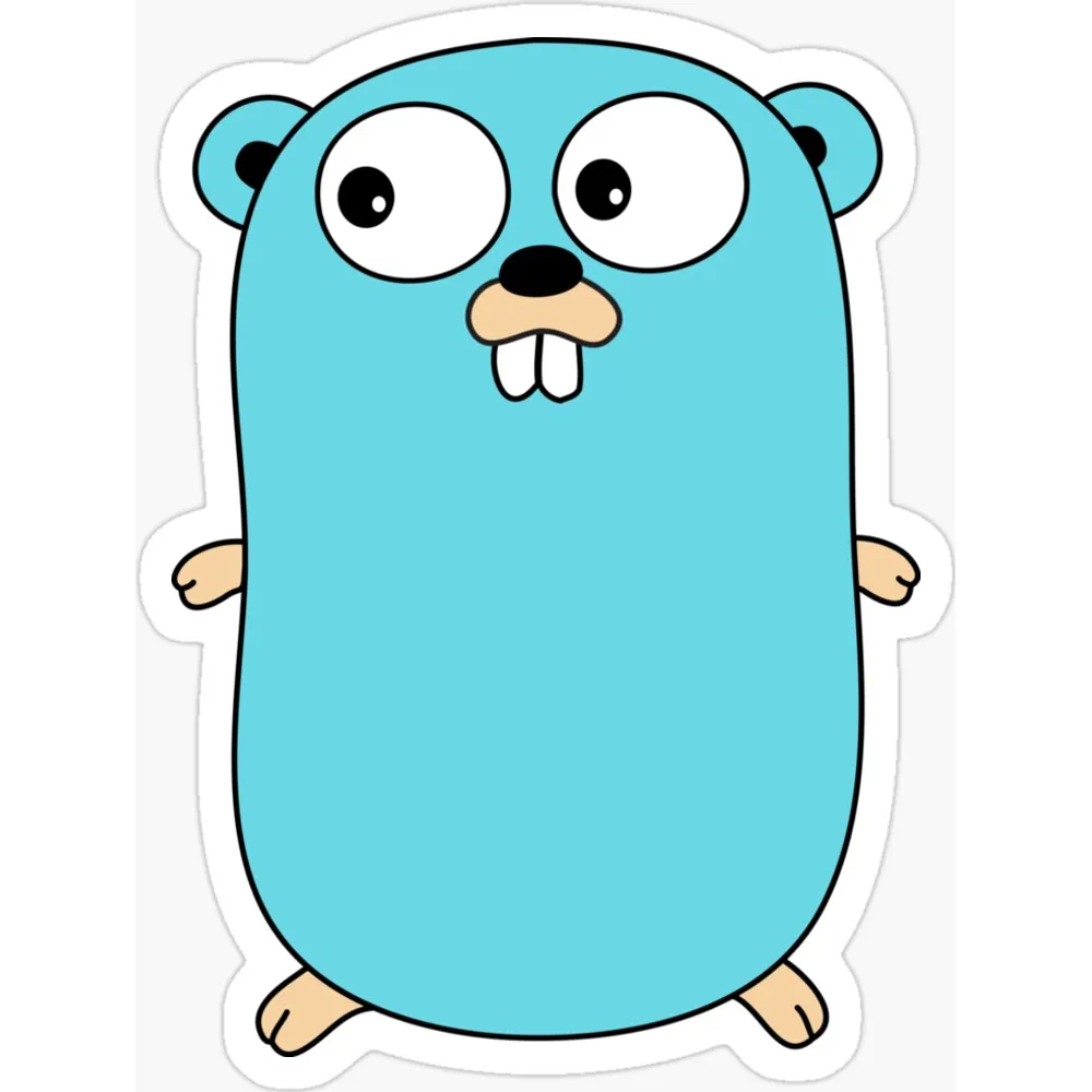
Look at the gopher properly and it’s a strange piece of design for a technology brand:
- The teeth are enormous and slightly wrong
- The eyes are set far too wide apart
- The limbs are stubby to the point of being vestigial
- The expression sits somewhere between curious and mildly concussed
None of that is what you’d get from a branding exercise. Corporate mascots are symmetrical, on-model, and drawn to survive being shrunk to 16 pixels. The gopher is asymmetric, off-model by default, and clearly the output of someone drawing rather than someone specifying.
That’s exactly why it works. It looks hand-made, because it is.
The licence is the interesting part
Here’s the thing that made the gopher spread: French released it under a Creative Commons Attribution licence. Not a restrictive trademark policy — an actual open licence permitting derivative work, provided you credit her.
The consequence is a genuinely enormous body of gopher variants. Gophers as chefs, as astronauts, as pirates. Gophers for individual Go projects, Go conferences, Go meetups in specific cities. The Go Gopher gallery and Ashley McNamara’s gopher artwork have both become small institutions.
Compare that to the average corporate mark, where using the logo at all requires reading a four-page brand policy and the answer is usually no. The gopher propagated because it was allowed to.
What it signals
There’s an argument that the gopher did real work for Go’s adoption. Go arrived as a language from Google, designed by people with serious systems credentials — Pike, Ken Thompson, Robert Griesemer — aimed squarely at infrastructure. That’s an intimidating package.
A slightly daft rodent takes the edge off. It says the language is meant to be approachable, that you’re not expected to have read the Plan 9 papers first. Go leaned hard into simplicity as a design value, and the mascot is that value in illustrated form.
Rust did something similar with Ferris a few years later — a public-domain crab softening a language with a reputation for a punishing learning curve. Gleam’s Lucy is the same move again, pastel pink over a type system with no escape hatches.
Turns out the friendly-mascot strategy has become standard, and Go got there first. The wider field guide traces where the rest of them came from — and why the licence, not the drawing, decides which ones you see everywhere.
A note on the merch
If you buy gopher merchandise, look closely at the teeth. The most common failure in gopher printing is a low-resolution source scaled up, and the teeth are where it shows first — they go from two crisp shapes to a grey smudge.
The licence permits derivative work. It doesn’t make a blurry one acceptable.