The seven spokes of the Kubernetes logo
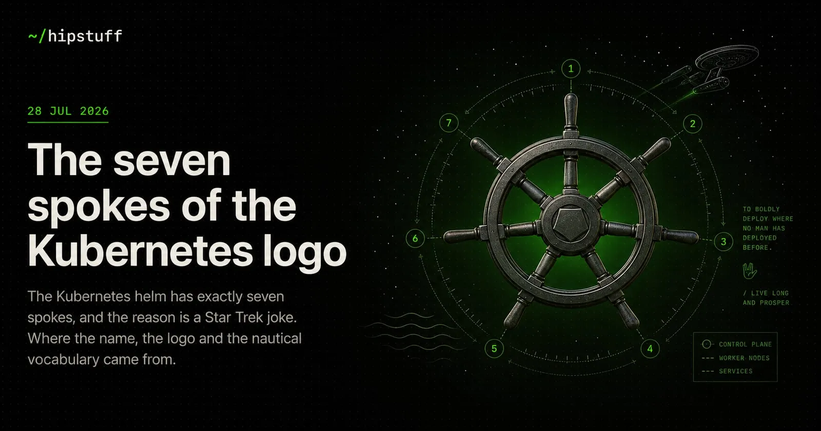
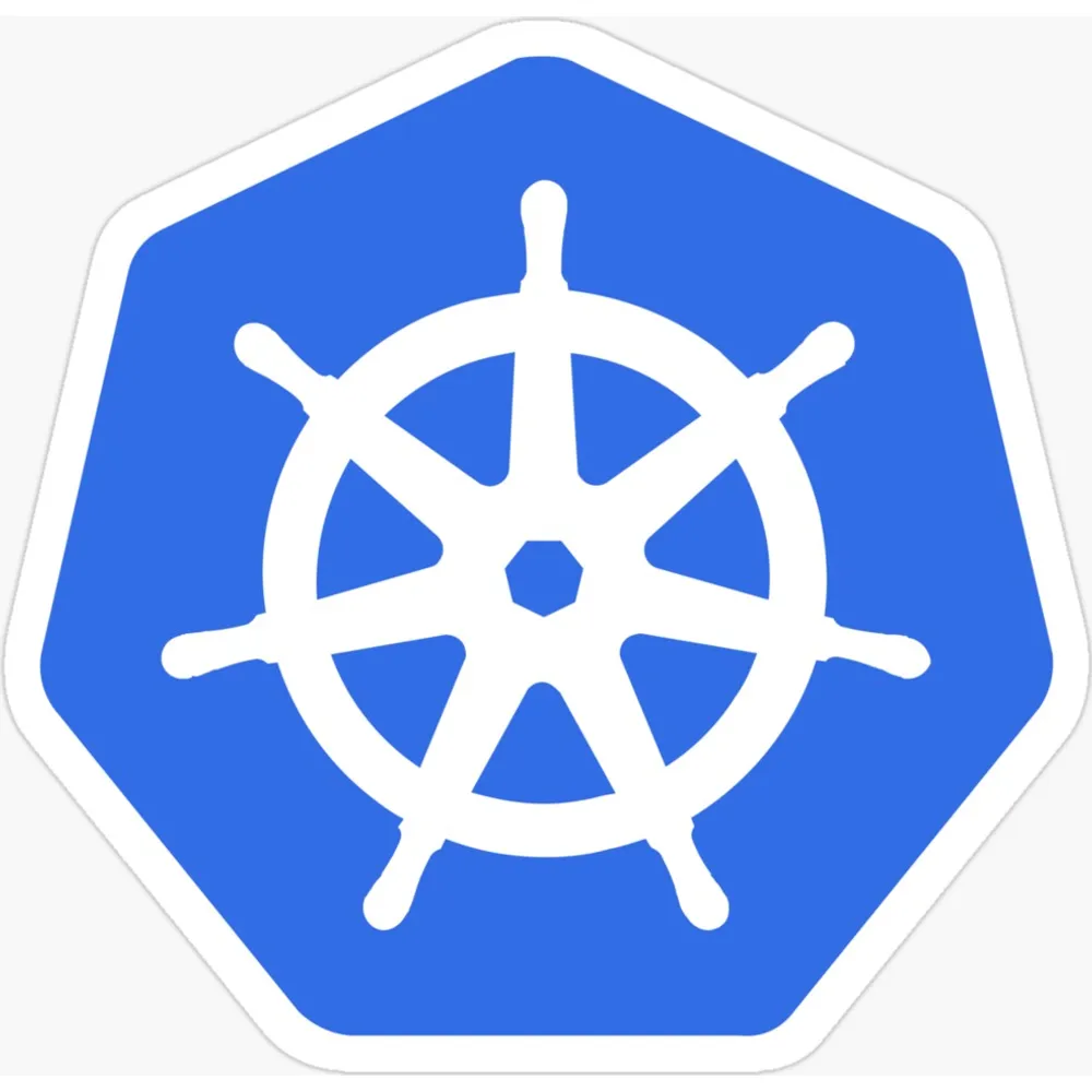
Count the spokes on the Kubernetes logo. There are seven.
Not six, which would tile more naturally. Not eight, which would be the obvious choice for something abbreviated to k8s. Seven — an awkward number to build radial symmetry from, chosen deliberately, and the reason is a Star Trek joke that survived into production.
Start with the name
Kubernetes comes from the Greek κυβερνήτης — kubernḗtes — meaning helmsman or pilot. The same root gives us “governor”, by way of the Latin gubernator, and “cybernetics”, which Norbert Wiener coined in 1948 from the identical word, for much the same reason: both fields are about steering something.
So the logo is a ship’s wheel because the software steers containers. That part is straightforward, and unusually literal for infrastructure branding.
The spoke count is where it gets interesting.
Google’s Borg problem
Before Kubernetes there was Borg — Google’s internal cluster manager, which had been scheduling workloads across their fleet since roughly 2003. Borg was enormously capable and, by most accounts, enormously unpleasant to use unless you had already spent years inside Google.
The name was not accidental either. Borg assimilates machines into a collective that acts as one. That is genuinely what a cluster manager does, and it is also a slightly menacing thing to call your infrastructure.
When Joe Beda, Brendan Burns and Craig McLuckie started building an open-source successor in 2013, the internal project name continued the joke. They called it Project Seven of Nine.
Why that specific Borg
Seven of Nine is the Star Trek: Voyager character who was assimilated by the Borg as a child and then severed from the collective — a Borg drone gradually recovering her humanity across four seasons.
As a name for “Borg, but approachable, and released to the public”, it is close to perfect. The lineage is explicit, and so is the softening.
The name did not survive to launch, for the reason you would expect: naming your product after a trademarked character belonging to a large studio is a conversation nobody wanted. So it became Kubernetes.
But Tim Hockin, who drew the logo, gave the helm seven spokes. The codename went into the mark instead of the masthead.
The nautical vocabulary is remarkably consistent
Once the helmsman metaphor was set, the ecosystem committed to it with more discipline than most open-source projects manage:
- Helm — the package manager. You steer with a helm.
- Charts — what Helm installs. Nautical charts.
- Tiller — Helm’s old server-side component, another steering mechanism. Removed in Helm 3, which quietly ended the metaphor’s best joke.
- Kubelet — the agent on each node. A small pilot.
- Pilot — the control plane component in Istio, extending the theme sideways.
Compare this to the average cloud-native project, where names are assembled from whatever nouns were still available on npm, and it stands out. Somebody was paying attention.
There is one more piece of naming worth mentioning: k8s. Not an acronym — a numeronym. K, eight letters, S. The same construction gives us i18n for internationalization and a11y for accessibility, and it exists because “Kubernetes” is genuinely annoying to type more than twice.
Why it works as a mark
Setting the trivia aside, the helm is a well-made logo, and the reason is geometric.
Seven-fold radial symmetry has no shortcuts. You cannot mirror it, you cannot halve it, and every spoke has to be placed by angle rather than by reflection. That constraint tends to produce marks that feel considered, because they had to be.
It also holds up small. There is no fine detail to lose, no gradient, no lettering that goes muddy at 64 pixels — which is why it survives being printed on things, unlike a great many logos designed exclusively for a browser tab. The Kubernetes designs here lean on exactly that.
A footnote on the language
Kubernetes is written in Go, and it is probably the single biggest reason Go became the default language for infrastructure tooling in the late 2010s. Docker, etcd, Prometheus, Terraform and Helm all followed.
Which means the Greek word for helmsman, filtered through a Star Trek joke about a rehabilitated Borg, ended up shaping which language a generation of platform engineers writes every day. If you want the gopher as well, that lineage is not the worst reason to — and the gopher has its own strange history, which starts at a radio station rather than at Google.
Next time someone asks why there are seven spokes, you have a better answer than “design decision”. It is a reference to a character who escaped a collective, on a logo for the software that replaced the collective.