18 designs
React merch
The atom, the cyan, and a decade of front-end arguments.

Flux Logo
The green Flux infinity, drawn as one unbroken line. Flux lost to Redux years ago, which makes this closer to a historical marker than a badge of current allegiance.
fn(d) = V
The React atom above fn(d) = V — the whole framework compressed into four characters. A function of data returns a view; everything else is implementation detail.
Keep Calm and React
The wartime poster format with the React atom where the crown belongs. The pun is obvious and the design knows it, which is why it commits fully rather than hedging.

MobX Logo
MobX's bracketed M on a burnt-orange tile — ]V[ if you read it as ASCII, which is how it was drawn. Observable state for people who found Redux exhausting.
Pixel Flux Logo
Flux's infinity loop in green pixel art. A deep enough cut that wearing it is essentially a claim about how long you have been doing this.
Pixel React Logo
The React atom rebuilt on a pixel grid, every orbital forced into stair-stepped diagonals. The curves lose their smoothness and gain a lot of character in the trade.

Pixel Redux Logo
Redux's trefoil dropped to a pixel grid. The three-way symmetry survives the resolution loss surprisingly intact, which says something about how well the mark was drawn.
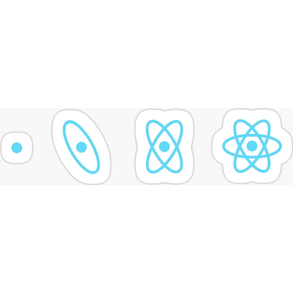
React Evolution
A single dot becoming an orbital, then two, then the full atom. Four frames of the React logo assembling itself, read left to right like a diagram in a physics textbook.
React Flux Redux Pattern
Redux purple, React cyan and Flux green tiled in rows of three. The state-management wars rendered as wallpaper, which is about the right level of seriousness.
React Heart Logo
The React atom with one of its three orbitals bent into a red heart. A small change that turns a framework logo into something you can give someone without it reading as corporate merchandise.
React Logo
The React atom, straight, in the correct cyan. No cleverness — just the mark, drawn properly, at a size that holds its edges through the print process.
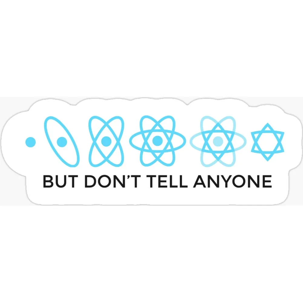
React Secret
The React atom drawn five times, each one gaining an orbital, under the words BUT DON'T TELL ANYONE. A joke about complexity creep that lands harder every year.
React Sticker Sheet
Four React atoms on one sheet, for people whose laptop lid is a CV. Enough to cover a laptop, a water bottle, a notebook and still have one spare for a colleague.

React Styleguidist
The Styleguidist octopus — a cyan cephalopod with a component library where its head should be. One of the few dev tools that bothered commissioning an actual character.
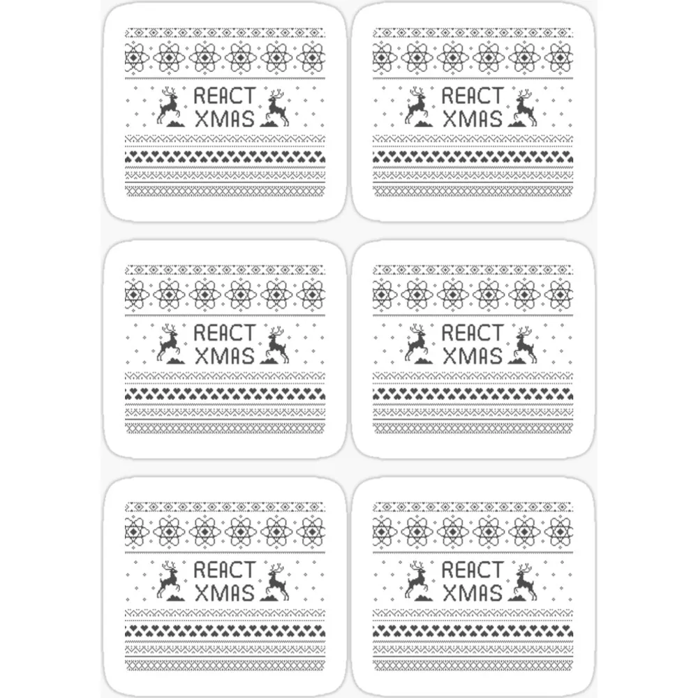
React Xmas Pattern
Nordic knitwear pattern with the React atom worked into the fair-isle repeat. The ugly-Christmas-jumper format, executed with more care than the genre usually gets.
Reactive Guy
The React atom in hot orange rather than the usual cyan, over REACTIVE GUY in slab caps. Reads like a 1970s job title, which is roughly the intended effect.

Redux Logo
The purple Redux trefoil — three arrows chasing each other in a closed loop. A logo that actually diagrams what the library does, which is rarer than it should be.
styled-components
The nail-polish emoji framed by angle brackets, over the library name in lowercase. Possibly the only logo in front-end whose entire concept is a single well-chosen emoji.
The React logo is an atom — a nucleus with three elliptical orbitals crossing it — and the reasoning is about as on-the-nose as logos get. React builds interfaces out of components, components are the smallest units you compose everything else from, therefore: atoms. It’s the kind of metaphor that would feel laboured if the execution weren’t so clean.
The colour does a lot of the work. That specific cyan, #61DAFB, is distinctive
enough that React people recognise it out of context, on a laptop lid across a
café. Very few technology brands manage a colour that functions as the logo on
its own.
There is a nice accident of physics in it too. Orbital diagrams like this one — the classic Rutherford-style atom with electrons on neat elliptical paths — are wrong. Electrons don’t orbit like planets; they occupy probability clouds. The diagram survives because it’s legible, not because it’s accurate, which is a reasonable description of a lot of good abstractions.
The React ecosystem has spawned a genuinely enormous amount of secondary iconography — Redux’s arrows, Flux’s flow, the styled-components moon — and much of it borrows the same visual grammar. The designs here cover the atom itself plus a few of the satellites.